9 Southwark Spatial Autocorrelation
This is a run through of the previous Spatial Autocorrelation section but using data from the London Borough of Southwark, not Camden. It includes the additonal data collection steps and is a useful revision excercise.
9.1 First we need to download the data we need.
9.2 Downloading data from the CDRC data website
On an internet browser go to https://data.cdrc.ac.uk/
In the top right of the screen you will see options to log in or register for an account. If you have not yet registered please sign up to an account now.
We are going to be interested in Census data for the borough of Southwark. There are several routes to this dataset which include a search bar at the top of each page. However, we shall browse the website.
CDRC Data Statistics:

On the tab panel at the top of the page, click on Topics.
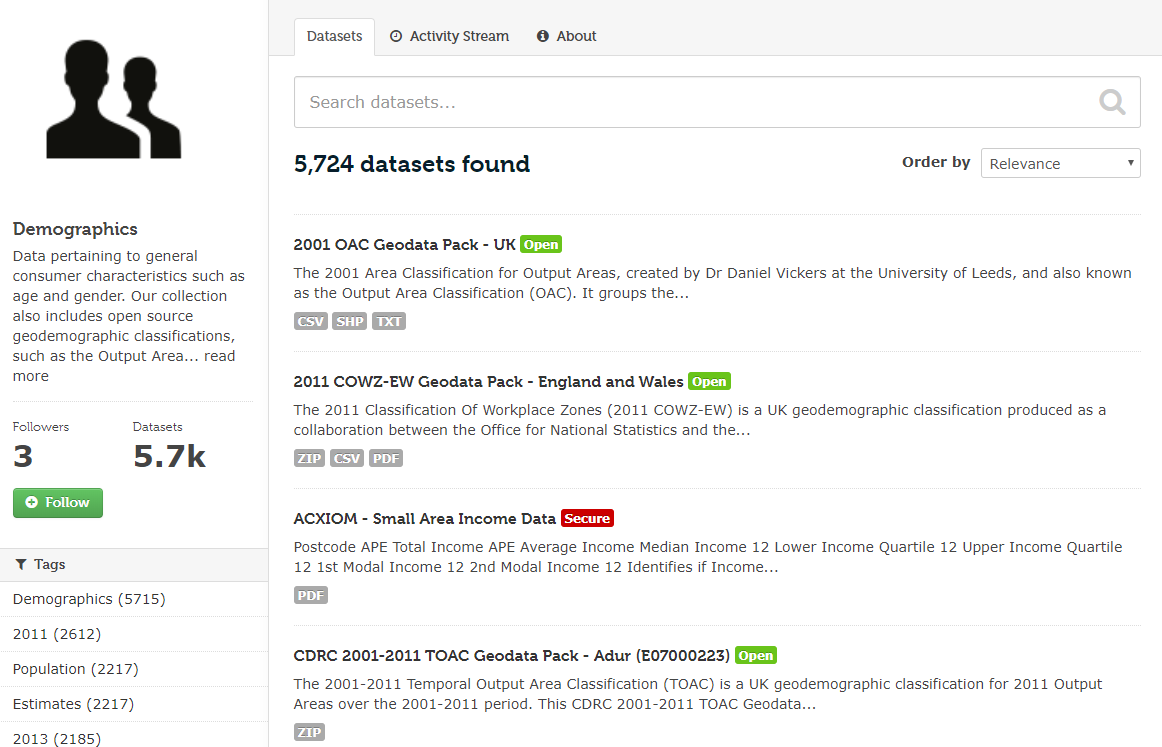
The data available on the CDRC data website can be broadly grouped into 11 key themes. Most of these pertain to the population and human activities. All of these themes are important to a wide range of industries, notably including retail. Census data can be found by clicking on the Demographics topic.
![]()
However, within this option there is still a very large number of datasets as the CDRC stores data on every district within the UK. In the search bar at the top of the page, enter ‘Southwark’.
You now want to scroll down to CDRC 2011 Census Data Packs for Local Authority District: Southwark (E09000028). It can also be found by clicking on the Census tab on the side of the screen.
The following page describes the content of the data and disclosure controls. The data is provided as a zipped folder of several different tables of Census data which encompass a wide variety of variables on the population. In addition, data is also provided at three different geographic scales of data units - Output Area, Lower Super Output Area and Middle Super Output Area.
To download the file you must click on Southwark.zip under Data and Resources. If you have not already done so, here you will be asked to freely register as a new user.
It is recommended that you move the downloaded Southwark.zip file to somewhere appropriate in your directory and then unzip the folder. To unzip on a windows computer simply right-click on the zipped file in windows explorer and click on “Extract All”.
The folder includes lots of useful data. The tables subfolder is where the Census data is stored in its various forms. However, each table is given a name which is not informative to us, so the datasets_description file is provided so we can lookup their names. In addition to this, a variables_description is provided so we can look up the variable name codes within each data table. GIS shapefiles hare also available from the shapefiles subfolder, these will be useful for mapping the data.
The Census data includes a large number of different datasets, all stored as Comma Separated Values (.csv) files. CSVs are a simple means of storing data so that it can be easily read and written on a computer. They are simply plain text documents where commas are used to separate the fields of data (you can observe this if you open a CSV in notepad).
For the forthcoming practicals we will be considering three variables, each from a different census dataset. These will be:
| ColumnVariableCode | ColumnVariableDescription | DatasetId | DatasetTitle |
|---|---|---|---|
| KS201EW0020 | White: English/Welsh/Scottish/Northern Irish/British | KS201EW | Ethnic group |
| KS403EW0012 | Occupancy rating (bedrooms) of -1 or less | KS403EW | Rooms, bedrooms and central heating |
| KS501EW0019 | Highest level of qualification: Level 4 qualifications and above | KS501EW | Qualifications and students |
| KS601EW0016 | Economically active: Employee: Full-time | KS601EW | Economic activity |
Level 4 qualifications refer to a Certificate of Higher Education Higher National Certificate (awarded by a degree-awarding body).
9.3 Loading data and data formatting in R
Our first step is to set the working directory. This is so R knows where to open and save files to. It is recommended that you set the working directory to an appropriate space in your computers work space. In this example it is the same folder as where the Census data pack has been stored.
To set the working directory, go to the Files table in the Files and Plots window in RStudio. If you click on this tab you can then navigate to the folder you wish to use. You can then click on the More button and then Set as Working Directory. You should then see some code similar to the below appear in the command line.
Alternatively, you can type in the address of the working directory manually using the setwd() function as demonstrated below. This requires you to type in the full address of where your data are stored.
#Set the working directory. The bit between the "" needs to specify the path to the folder you wish to use (you will see my file path below).
setwd("../learningR/") # Note the single / (\\ will also work).
Our next steps are to load the data into R.
9.4 Loading data into R
One of R’s great strengths is its ability to load in data from almost any file format. Comma Separated Value (CSV) files are often a preferred choice for data due to their small file sizes and simplicity. We are going to open three different datasets from the Census database. Their codes and dataset names are written in the table in the previous page. We will be downloading Output Area level data, so only files with “oa11” included in their filenames.
We can read CSVs into R using the read.csv() function as demonstrated below. This requires us to identify the file location within our workspace, and also assign an object name for our data in R.
# read.csv() loads a csv, remember to correctly input the file location within your working directory
ethnicity <- read.csv("worksheet_data/Southwark/tables/KS201EW_oa11.csv")
rooms <- read.csv("worksheet_data/Southwark/tables/KS403EW_oa11.csv")
qualifications <-read.csv("worksheet_data/Southwark/tables/KS501EW_oa11.csv")
employment <-read.csv("worksheet_data/Southwark/tables/KS601EW_oa11.csv")
9.5 Viewing data
With the data now loaded into RStudio, they can be observed in the objects window. Alternatively, you can open them with the View function as demonstrated below.
# to view the top 1000 cases of a data frame
View(employment)
All functions need a series of arguments to be passed to them in order to work. These arguments are typed within the brackets and typically comprise the name of the object (in the examples above its the DOB) that contains the data followed by some parameters. The exact parameters required are listed in the functions’ help files. To find the help file for the function type ? followed by the function name, for example - ?View
There are two problems with the data. Firstly, the column headers are still codes and are therefore uninformative. Secondly, the data is split between three different data objects.
First let’s reduce the data. The Key Statistics tables in the CDRC Census data packs contain both counts and percentages. We will be working with the percentages as the populations of Output Areas are not identical across our sample.
9.6 Observing column names
To observe the column names for each dataset we can use a simple names() function. It is also possible to work out their order in the columns from observing the results of this function.
# view column names of a dataframe
names(employment)
#>  [1] "GeographyCode" "KS601EW0001"   "KS601EW0002"   "KS601EW0003"
#>  [5] "KS601EW0004"   "KS601EW0005"   "KS601EW0006"   "KS601EW0007"
#>  [9] "KS601EW0008"   "KS601EW0009"   "KS601EW0010"   "KS601EW0011"
#> [13] "KS601EW0012"   "KS601EW0013"   "KS601EW0014"   "KS601EW0015"
#> [17] "KS601EW0016"   "KS601EW0017"   "KS601EW0018"   "KS601EW0019"
#> [21] "KS601EW0020"   "KS601EW0021"   "KS601EW0022"   "KS601EW0023"
#> [25] "KS601EW0024"   "KS601EW0025"   "KS601EW0026"   "KS601EW0027"
#> [29] "KS601EW0028"   "KS601EW0029"
From using the variables_description csv from our datapack, we know the Economically active: Unemployed percentage variable is recorded as KS601EW0017. This is the 19th column in the employment dataset.
9.7 Selecting columns
Next we will create new data objects which only include the columns we require. The new data objects will be given the same name as the original data, therefore overriding the bigger file in R. Using the variable_description csv to lookp the codes, we have isolated only the columns we are interested in. Remember we are downloading percentages, not raw counts.
# selecting specific columns only
# note this action overwrites the labels you made for the original data,
# so if you make a mistake you will need to reload the data into R
ethnicity <- ethnicity[, c(1, 21)]
rooms <- rooms[, c(1, 13)]
employment <- employment[, c(1, 20)]
qualifications <- qualifications[, c(1, 20)]
9.8 Renaming column headers
Next we want to change the names of the codes to ease our interpretation. We can do this using names().
If we wanted to change an individual column name we could follow the approach detailed below. In this example, we tell R that we are interested in setting the name Unemployed to the 2nd column header in the data.
# to change an individual column name
names(employment)[2] <- "Unemployed"
However, we want to name both column headers in all of our data. To do this we can enter the following code. The c() function allows us to concatenate multiple values within one command.
# to change both column names

names(ethnicity)<- c("OA", "White_British")
names(rooms)<- c("OA", "Low_Occupancy")
names(employment)<- c("OA", "Unemployed")
names(qualifications)<- c("OA", "Qualification")
9.9 Joining data in R
We next want to combine the data into a single dataset. Joining two data frames together requires a common field, or column, between them. In this case it is the OA field. In this field each OA has a unique ID (or OA name), this IDs can be used to identify each OA between each of the datasets.
In R the merge() function joins two datasets together and creates a new object. As we are seeking to join four datasets we need to undertake multiple steps as follows.
#1 Merge Ethnicity and Rooms to create a new object called "merged_data_1"
merged_data_1 <- merge(ethnicity, rooms, by="OA")

#2 Merge the "merged_data_1" object with Employment to create a new merged data object
merged_data_2 <- merge(merged_data_1, employment, by="OA")

#3 Merge the "merged_data_2" object with Qualifications to create a new data object
census_data <- merge(merged_data_2, qualifications, by="OA")

#4 Remove the "merged_data" objects as we won't need them anymore
rm(merged_data_1, merged_data_2)
Our newly formed census_data object contains all four variables.
9.10 Exporting Data
You can now save this file to your workspace folder. Remember R is case sensitive so take note of when object names are capitalised.
# Writes the data to a csv named "practical_data_Southwark" in your file directory
write.csv(census_data, "worksheet_data/Southwark/practical_data_Southwark.csv", row.names=F)
In this practical we will: * Run a global spatial autocorrelation for the borough of Southwark * Identify local indicators of spatial autocorrelation * Run a Getis-Ord
First we must set the working directory and load the practical data.
# Remember to set the working directory as usual

# Load the data. You may need to alter the file directory
Census.Data <-read.csv("worksheet_data/Southwark/practical_data_Southwark.csv")
We will also need the load the spatial data files from the previous practicals.
# load the spatial libraries
library("sp")
library("rgdal")
library("rgeos")

# Load the output area shapefiles
Output.Areas <- readOGR("worksheet_data/Southwark/shapefiles", "Southwark_oa11")
#> OGR data source with driver: ESRI Shapefile
#> Source: "/Users/jamestodd/Desktop/GitHub/learningR/worksheet_data/Southwark/shapefiles", layer: "Southwark_oa11"
#> with 893 features
#> It has 1 fields
# join our census data to the shapefile
OA.Census <- merge(Output.Areas, Census.Data, by.x="OA11CD", by.y="OA")
Remember the distribution of our qualification variable? We will be working on that today. We should first map it to remind us of its spatial pattern.
library("tmap")

tm_shape(OA.Census) + tm_fill("Qualification", palette = "Reds", style = "quantile", title = "% with a Qualification") + tm_borders(alpha=.4)
#> Legend labels were too wide. The labels have been resized to 0.47, 0.47, 0.47, 0.47, 0.47. Increase legend.width (argument of tm_layout) to make the legend wider and therefore the labels larger.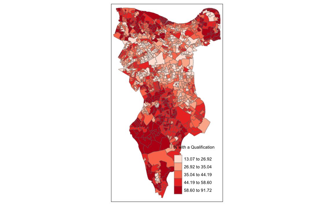
9.11 Running a spatial autocorrelation
A spatial autocorrelation measures how distance influences a particular variable across a dataset. In other words, it quantifies the degree of which objects are similar to nearby objects. Variables are said to have a positive spaital autocorrelation when similar values tend to be nearer together than dissimilar values.
Waldo Tober’s first law of geography is that “Everything is related to everything else, but near things are more related than distant things.” so we would expect most geographic phenomena to exert a spatial autocorrelation of some kind. In population data this is often the case as persons of similar characteristics tend to reside in similar neighbourhoods due to a range of reasons including house prices, proximity to work places and cultural factors.
We will be using the spatial autocorrelation functions available from the spdep package.
library(spdep)9.11.1 Finding neighbours
In order for the subsequent model to work, we need to work out what polygons neighbour each other. The following code will calculate neighbours for our OA.Census polygon and print out the results below.
# Calculate neighbours
neighbours <- poly2nb(OA.Census)
neighbours
#> Neighbour list object:
#> Number of regions: 893
#> Number of nonzero links: 5140
#> Percentage nonzero weights: 0.645
#> Average number of links: 5.76
We can plot the links between neighbours to visualise their distribution across space.
plot(OA.Census, border = 'lightgrey')
plot(neighbours, coordinates(OA.Census), add=TRUE, col='red')
# Calculate the Rook's case neighbours
neighbours2 <- poly2nb(OA.Census, queen = FALSE)
neighbours2
#> Neighbour list object:
#> Number of regions: 893
#> Number of nonzero links: 4976
#> Percentage nonzero weights: 0.624
#> Average number of links: 5.57We can already see that this approach has identified fewer links between neighbours. By plotting both neighbour outputs we can interpret their differences.
# compares different types of neighbours
plot(OA.Census, border = 'lightgrey')
plot(neighbours, coordinates(OA.Census), add=TRUE, col='blue')
plot(neighbours2, coordinates(OA.Census), add=TRUE, col='red')
We can represent spatial autocorrelation in two ways; globally or locally. Global models will create a single measure which represent the entire data whilst local models let us explore spatial clustering across space.
9.11.2 Running a global spatial autocorrelation
With the neighbours defined. We can now run a model. First we need to convert the data types of the neighbours object. This file will be used to determine how the neighbours are weighted
# Convert the neighbour data to a listw object
listw <- nb2listw(neighbours2)
listw
#> Characteristics of weights list object:
#> Neighbour list object:
#> Number of regions: 893
#> Number of nonzero links: 4976
#> Percentage nonzero weights: 0.624
#> Average number of links: 5.57
#>
#> Weights style: W
#> Weights constants summary:
#>     n     nn  S0  S1   S2
#> W 893 797449 893 343 3727
We can now run the model. This type of model is known as a moran’s test. This will create a correlation score between -1 and 1. Much like a correlation coefficient, 1 determines perfect postive spatial autocorrelation (so our data is clustered), 0 identifies the data is randomly distributed and -1 represents negative spatial autocorrelation (so dissimilar values are next to each other).
# global spatial autocorrelation
moran.test(OA.Census$Qualification, listw)
#>
#>  Moran I test under randomisation
#>
#> data:  OA.Census$Qualification
#> weights: listw
#>
#> Moran I statistic standard deviate = 30, p-value <2e-16
#> alternative hypothesis: greater
#> sample estimates:
#> Moran I statistic       Expectation          Variance
#>          0.587052         -0.001121          0.000428
The moran I statistic is 0.54, we can therefore determine that there our qualification variable is positively autocorrelated in Southwark. In other words, the data does spatially cluster. We can also consider the p-value to consider the statistical significance of the mode.
9.11.3 Running a local spatial autocorrelation
We will first create a moran plot which looks at each of the values plotted against their spatially lagged values. It basically explores the relationship between the data and their neighbours as a scatter plot.
# creates a moran plot
moran <- moran.plot(OA.Census$Qualification, listw = nb2listw(neighbours2, style = "C"),asp=T)
Is it possible to determine a positive relationship from observing the scatter plot?
# creates a local moran output
local <- localmoran(x = OA.Census$Qualification, listw = nb2listw(neighbours2, style = "W"))
By considering the help page for the localmoran function (run ?localmoran in R) we can observe the arguments and outputs. We get a number of useful statistics from the mode which are as defined:
| Name | Description |
|---|---|
| Ii | local moran statistic |
| E.Ii | expectation of local moran statistic |
| Var.Ii | variance of local moran statistic |
| Z.Ii | standard deviation of local moran statistic |
| Pr() | p-value of local moran statistic |
First we will map the local moran statistic (Ii). A positive value for Ii indicates that the unit is surrounded by units with similar values.
# binds results to our polygon shapefile
moran.map <- OA.Census
moran.map@data<- cbind(OA.Census@data, local)
# maps the results
tm_shape(moran.map) + tm_fill(col = "Ii", style = "quantile", title = "local moran statistic")
#> Variable "Ii" contains positive and negative values, so midpoint is set to 0. Set midpoint = NA to show the full spectrum of the color palette.
#> Legend labels were too wide. The labels have been resized to 0.42, 0.44, 0.47, 0.47, 0.47. Increase legend.width (argument of tm_layout) to make the legend wider and therefore the labels larger.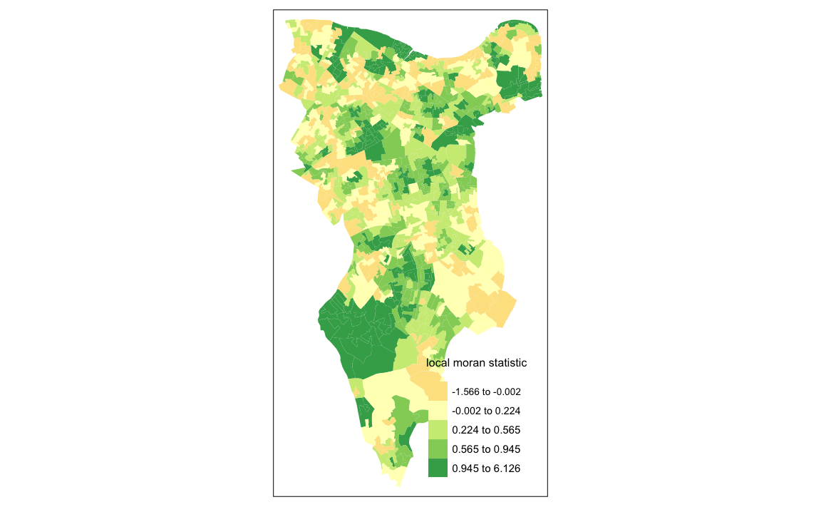 From the map it is possible to exist the variations in autocorrelation across space. We can interpret that there seems to be a geographic pattern to the autocorrelation. However, it is not possible to understand if these are clusters of high or low values.
Why not try to make a map of the P-value to observe variances in significance across Southwark? Use names(moran.map@data) to find the column headers.
One thing we could try to do is to create a map which labels the features based on the types of relationships they share with their neighbours (i.e. high and high, low and low, insigificant, etc…). For this we refer back to the Moran’s I plot created a few moments ago.
moran <- moran.plot(OA.Census$Qualification, listw = nb2listw(neighbours2, style = "C"),asp=T)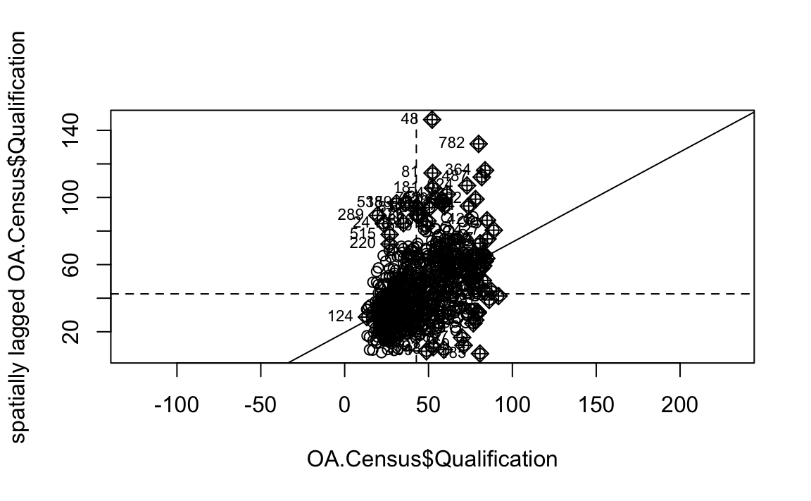
You’ll notice that the plots features a vertical and horizontal line that break it into the quandrants. Top right in the plot are areas with a high value surrounded by areas with a high value, bottom left are low value areas surrounded by low values. Top left is “Low-High” bottom right is “High-Low”.
The code below first extracts the data that fall in each quadrant and assigns them either 1,2,3,4 depending on which they fall into, and those values deemed insignificant get assigned zero.
### to create LISA cluster map ###
quadrant <- vector(mode="numeric",length=nrow(local))

# centers the variable of interest around its mean
m.qualification <- OA.Census$Qualification - mean(OA.Census$Qualification)

# centers the local Moran's around the mean
m.local <- local[,1] - mean(local[,1])

# significance threshold
signif <- 0.1

# builds a data quadrant
quadrant[m.qualification <0 & m.local<0] <- 1
quadrant[m.qualification <0 & m.local>0] <- 2
quadrant[m.qualification >0 & m.local<0] <- 3
quadrant[m.qualification >0 & m.local>0] <- 4
quadrant[local[,5]>signif] <- 0
We can now build the plot based on these values - assigning each a colour and also a label.
# plot in r
brks <- c(0,1,2,3,4)
colors <- c("white","blue",rgb(0,0,1,alpha=0.4),rgb(1,0,0,alpha=0.4),"red")
plot(OA.Census,border="lightgray",col=colors[findInterval(quadrant,brks,all.inside=FALSE)])
box()legend("bottomleft",legend=c("insignificant","low-low","low-high","high-low","high-high"),
fill=colors,bty="n")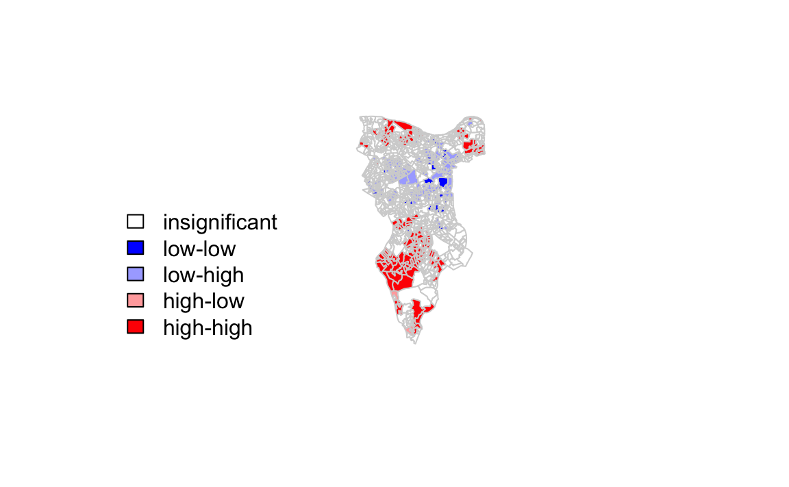
The resulting map reveals that it is apparent that there is a statistically significant geographic pattern to the clustering of our qualification variable in Southwark.
9.12 Getis-Ord
Another approach we can take is hot-spot analysis. The Getis-Ord Gi Statistic looks at neighbours within a defined proximity to identify where either high or low values cluster spatially.Here statistically significant hot spots are recognised as areas of high values where other areas within a neighbourhood range also share high values too.
First we need to define a new set of neighbours. Whilst the spatial autocorrection considered units which shared borders, for Getis-Ord we are defining neighbours based on proximity.
# creates centroid and joins neighbours within 0 and x units
nb <- dnearneigh(coordinates(OA.Census),0,800)
# creates listw
nb_lw <- nb2listw(nb, style = 'B')
# plot the data and neighbours
plot(OA.Census, border = 'lightgrey')
plot(nb, coordinates(OA.Census), add=TRUE, col = 'red')We will use a search 800 meters for our model in Southwark. This can be adjusted.
With a set of neighbourhoods estabilished we can now run the test.
# compute Getis-Ord Gi statistic
local_g <- localG(OA.Census$Qualification, nb_lw)

local_g_sp<- OA.Census

local_g_sp@data <- cbind(OA.Census@data, as.matrix(local_g))
names(local_g_sp)[6] <- "gstat"

# map the results
tm_shape(local_g_sp) + tm_fill("gstat", palette = "RdBu", style = "pretty") + tm_borders(alpha=.4)
#> Variable "gstat" contains positive and negative values, so midpoint is set to 0. Set midpoint = NA to show the full spectrum of the color palette.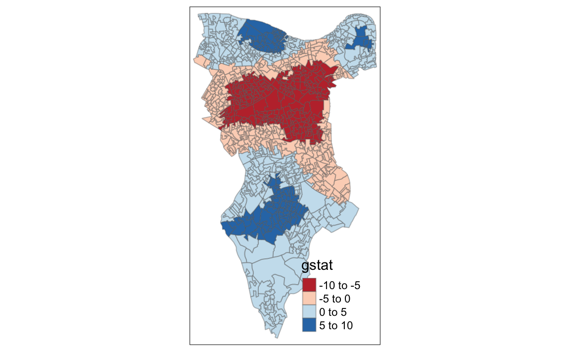
The Gi Statistic is represented as a Z-score. Greater values represent a greater intensity of clustering and the direction (positive or negative) indicates high or low clusters.