3 Getting to Know Your Data: Descriptive Statistics and Plots
For this tutorial we will continue to use the pop object created last week. You may still have it loaded into your R workspace. To check if you do you can use the ls() command. Type this into the command line and see if pop is printed. If not you can simply reload it:
#first set your working directory as before, remember your file path may be different to mine.

#setwd("~/Intro_R")

#load in csv file
pop<- read.csv("worksheet_data/camden/census-historic-population-borough.csv")
Use the head() command to remind yourself of the structure of the pop data frame. You should see 25 columns of data.
3.1 Plotting Data with R
Tools to create high quality plots have become one of R’s greatest assets. This is a relatively recent development, since the software has traditionally been focused on the statistics rather than visualisation. The standard installation of R has base graphic functionality built in to produce very simple plots. For example we can plot the relationship between the London population in 1811 and 1911.
#left of the comma is the x-axis, right is the y-axis. Also note how we are using the $ command to select the columns of the data frame we want.

plot(pop$Persons.1811,pop$Persons.1911)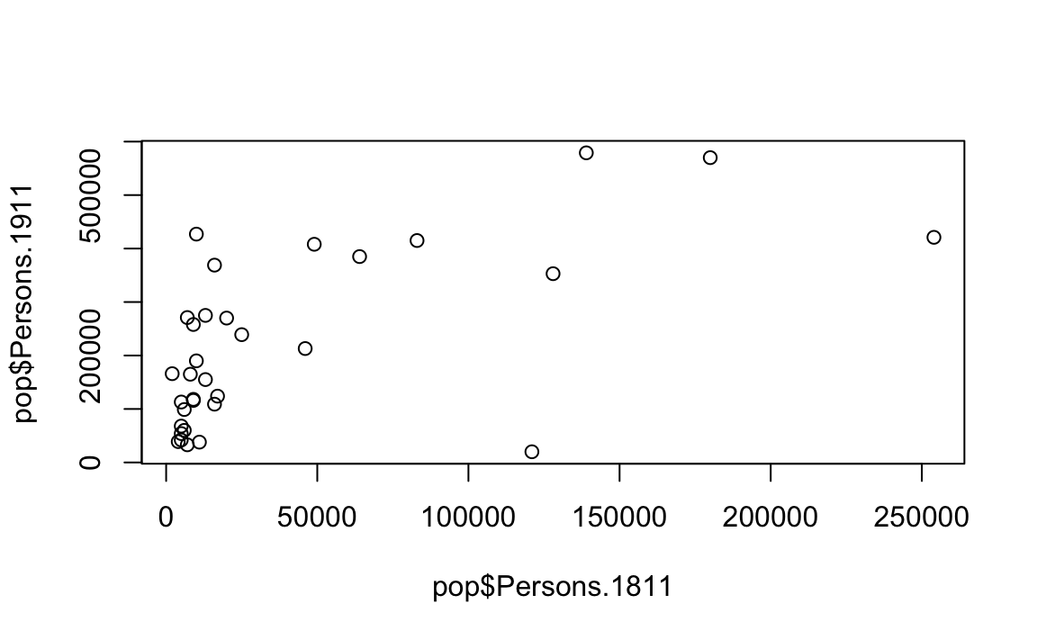
You should see a very simple scatter graph. The plot command offers a huge number of options for customisation. You can see them using the ?plot help pages and also the ?par help pages (par in this case is short for parameters). There are some examples below (note how the parameters come after the x and y columns).
#Add a title, change point colour, change point size

plot(pop$Persons.1811,pop$Persons.1911, main="My first R plot", col="blue", cex=2)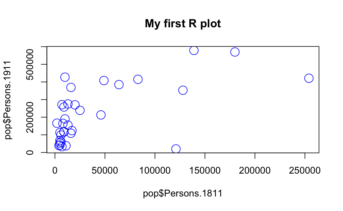
#Add a title, change point colour, change point symbol

plot(pop$Persons.1811,pop$Persons.1911, main="My first R plot", col="magenta", pch=22)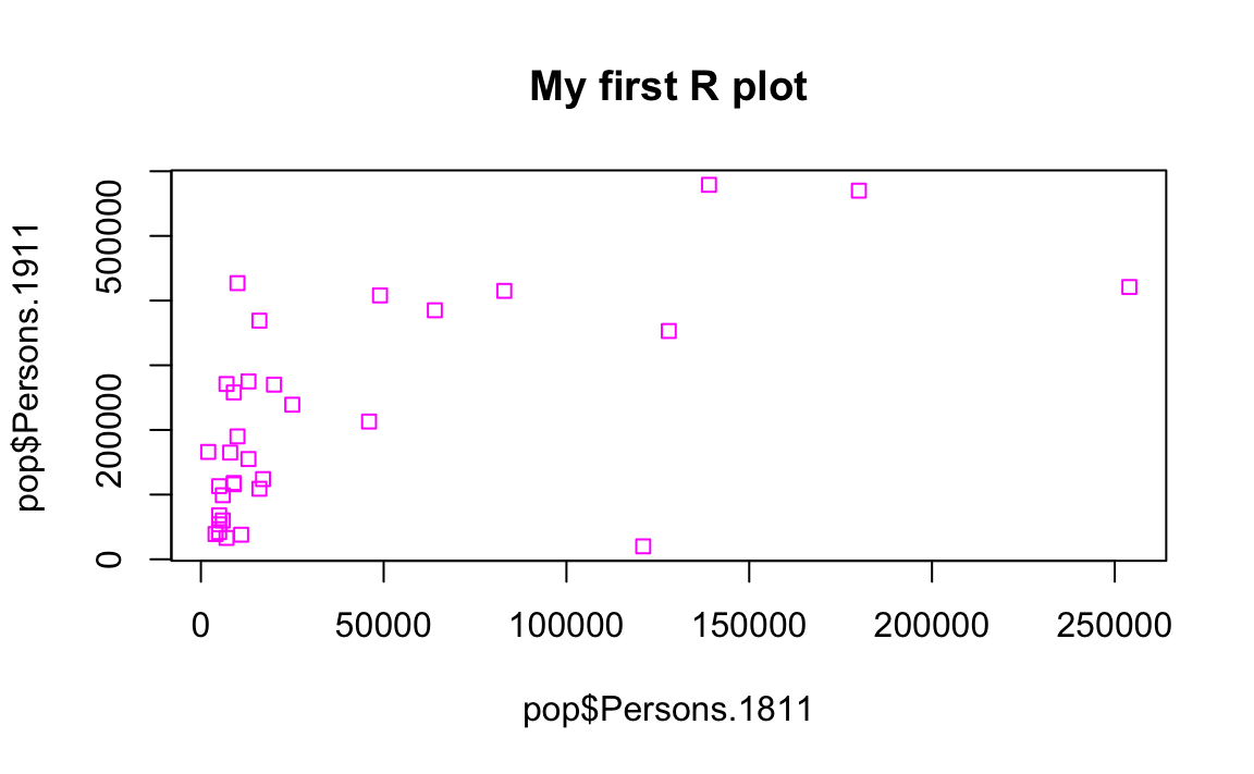
For more information on the plot parameters (some have obscure names) see here: http://www.statmethods.net/advgraphs/parameters.html
3.2 ggplot2
A slightly different method of creating plots in R requires the ggplot2 package. There are many hundreds of packages in R each designed for a specific purpose. These are not installed automatically, so each one has to be downloaded and then we need to tell R to use it. To download and install the ggplot2 package type the following:
#When you hit enter R will ask you to select a mirror to download the package contents from. It doesn't really matter which one you choose, I tend to pick the UK based ones.

install.packages("ggplot2")
The install.packages step only needs to be performed once. You don’t need to install a the package every time you want to use it. However, each time you open R and wish to use a package you need to use the library() command to tell R that it will be required.
library("ggplot2")The package is an implementation of the Grammar of Graphics (Wilkinson 2005) - a general scheme for data visualisation that breaks up graphs into semantic components such as scales and layers. ggplot2 can serve as a replacement for the base graphics in R and contains a number of default options that match good visualisation practice.
Whilst the instructions are step by step you are encouraged to deviate from them (trying different colours for example) to get a better understanding of what we are doing. For further help, ggplot2 is one of the best documented packages in R and has an extensive website: http://docs.ggplot2.org/current/. Good examples of graphs can also be found on the website cookbook-r.com.
p <- ggplot(pop, aes(Persons.1811, Persons.1911))What you have just done is set up a ggplot object where you say where you want the input data to come from – in this case it is the pop object. The column headings within the aes() brackets refer to the parts of that data frame you wish to use (the variables Persons.1811 and Persons.1911). aes is short for ‘aesthetics that vary’ – this is a complicated way of saying the data variables used in the plot. If you just type p and hit enter you get the error No layers in plot. This is because you have not told ggplot what you want to do with the data. We do this by adding so-called geoms, in this case geom_point(), to create a scatter plot.
p + geom_point()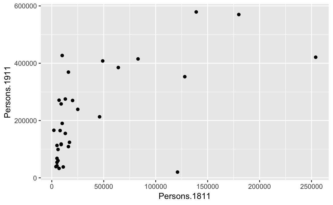
You can already see that this plot is looking a bit nicer than the one we created with the base plot() function used above. Within the geom_point() brackets you can alter the appearance of the points in the plot. Try something like p + geom_point(colour = "red", size=2) and also experiment with your own colours/ sizes. If you want to colour the points according to another variable it is possible to do this by adding the desired variable into the aes() section after geom_point(). Here will indicate the size of the population in 2011 as well as the relationship between in the size of the population in 19811 and 1911.
p + geom_point(aes(colour = Persons.2011, size = 2))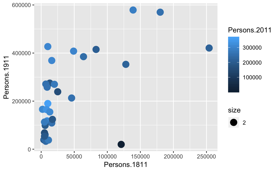
You will notice that ggplot has also created a key that shows the values associated with each colour. In this slightly contrived example it is also possible to resize each of the points according to the Persons.2011 variable.
p + geom_point(aes(size = Persons.2011))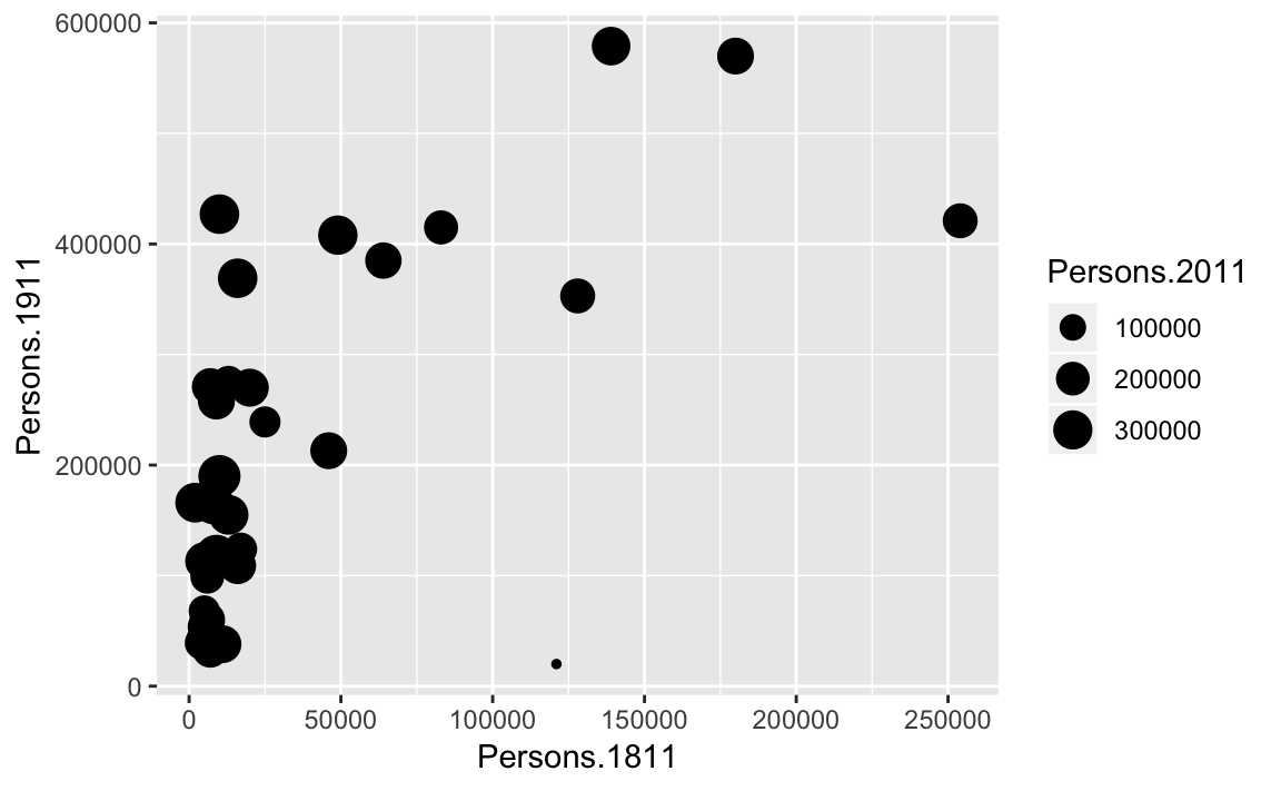
The real power of ggplot2 lies in its ability build a plot up as a series of layers. This is done by stringing plot functions (geoms) together with the + sign. In this case we can add a text layer to the plot using geom_text().
p + geom_point(aes(size = Persons.2011)) + geom_text(size = 2,colour="red",
    aes(label = Area.Name))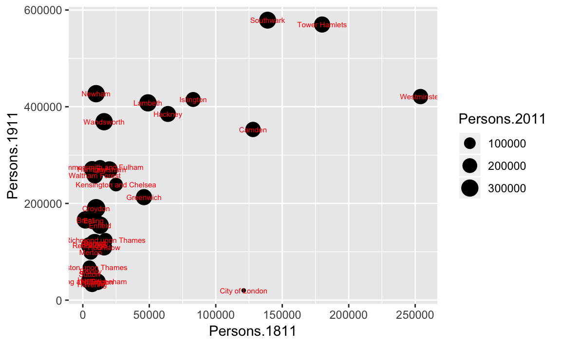
This idea of layers (or geoms) is quite different from the standard plot functions in R, but you will find that each of the functions does a lot of clever stuff to make plotting much easier (see the ggplot2 documentation for a full list). The above code adds London Borough labels to the plot over the points they correspond to. This isn’t perfect since many of the labels overlap but they serve as a useful illustration of the layers. To make things a little easier the plot can be saved as a PDF using the ggsave command. When saving the plot can be enlarged to help make the labels more legible.
ggsave(filename = "output_folder/first_ggplot.pdf", plot = p, scale=2)
#> Saving 12 x 7.42 in image
ggsave only works with plots that were created with ggplot. Within the brackets you should create a file name for the plot - this needs to include the file format (in this case .pdf you could also save the plot as a .jpg file). The file will be saved to your working directory. The scale controls how many times bigger you want the exported plot to be than it currently is in the plot window. Once executed you should be able to see a PDF file in your working directory.
3.2.1 Quick Recap
The previous section covered: 1. The creation of scatter plots using the base plot functionality in R. 2. Installing and loading additional packages in R. 3. The basics of the ggplot2 package for creating plots including: 1. Plot layers (geoms) 2. Where to specific the data variables (within the aes() brackets) 3. Saving your plot.
3.3 Describing Data - Statistics
In addition to plotting, descriptive statistics offer a further tool for getting to know your data. They provide useful summaries of a dataset and along with intelligent plotting can also provide a good “sanity check” to ensure the data conform to expectations. For the rest of this tutorial we will change our dataset to one containing the number of assault incidents that ambulances have been called to in London between 2009 and 2011. You will need to download a revised version of this file from Moodle: ambulance_assault.csv and upload it to your working directory (replace your existing file). It is in the same data format (CSV) as our London population file so we use the read.csv() command.
#read in the ambulance_assault datafile

input <- read.csv("worksheet_data/camden/ambulance_assault.csv")

#Check that the data have been loaded in correctly we can see the top 6 rows with the head() command.

head(input)
#>   Bor_Code     WardName WardCode                WardType assault_09_11
#> 1     00AA   Aldersgate   00AAFA Prospering Metropolitan            10
#> 2     00AA      Aldgate   00AAFB Prospering Metropolitan             0
#> 3     00AA    Bassishaw   00AAFC Prospering Metropolitan             0
#> 4     00AA Billingsgate   00AAFD Prospering Metropolitan             0
#> 5     00AA  Bishopsgate   00AAFE Prospering Metropolitan           188
#> 6     00AA Bread Street   00AAFF Prospering Metropolitan             0

#To get a sense of how large the data frame is, look at how many rows you have

nrow(input)
#> [1] 649
You will notice that the data table has 4 columns and 649 rows. The column headings are abbreviations of the following: You will notice that the data table has 4 columns and 649 rows. The column headings are abbreviations of the following: Bor_Code: Borough Code. London has 32 Boroughs (such as Camden, Islington, Westminster etc) plus the City of London at the centre. These codes are used as a quick way of referring to them from official data sources. WardName: Boroughs can be broken into much smaller areas known as Wards. These are electoral districts and have existed in London for centuries. WardCode: A statistical code for the Wards above. WardType: a classification that groups wards based on similar characteristics. assault_09_11: The number of assault incidents requiring an ambulance between 2009 and 2011 for each Ward. The mean(), median() and range() were some of the first R functions we used at the last week to describe our One.Direction dataset. We will use these to describe our assaults data as well as other descriptive statistics, including standard deviation.
#Calculate the mean of the assaults variable:

mean(input$assault_09_11)
#> [1] 173
## [1] 173.5
#Calculate the standard deviation of the assaults variable:

sd(input$assault_09_11)
#> [1] 130
## [1] 130.3
#Calculate the range, first starting by calculating the minimum and maximum values:
min(input$assault_09_11)
#> [1] 0
## [1] 0
max(input$assault_09_11)
#> [1] 1582
## [1] 1582
range(input$assault_09_11)
#> [1]    0 1582
## [1]    0 1582
These are commonly used descriptive statistics. To make things even easier, R has a summary() function that calculates a number of these routine statistics simultaneously.
summary(input$assault_09_11)
#>    Min. 1st Qu.  Median    Mean 3rd Qu.    Max.
#>       0      86     146     173     233    1582
You should see you get the minimum (Min.) and maximum (Max.) values of the assault_09_11 column; its first (1st Qu.) and third (3rd Qu.) quartiles that comprise the interquartile range; its the mean and the median. The built-in R summary() function does not calculate the standard deviation. There are functions in other libraries that calculate more detailed descriptive statistics, including describe() in the psych package , which we will use in the later tutorials. We can also use the summary() function to describe a categorical variable and it will list its levels:
summary(input$WardType)
#>     Accessible Countryside     Industrial Hinterlands
#>                          1                          8
#> Multicultural Metropolitan    Prospering Metropolitan
#>                        240                        169
#>        Student Communities    Suburbs and Small Towns
#>                          9                        210
#>  Traditional Manufacturing
#>                         12

#We can create the same output by creating a frequency table using the table() function

freqtable<-table(input$WardType)
freqtable
#>
#>     Accessible Countryside     Industrial Hinterlands
#>                          1                          8
#> Multicultural Metropolitan    Prospering Metropolitan
#>                        240                        169
#>        Student Communities    Suburbs and Small Towns
#>                          9                        210
#>  Traditional Manufacturing
#>                         12


#To find the table of proportion we can use the prop.table() function

prop.table(freqtable)
#>
#>     Accessible Countryside     Industrial Hinterlands
#>                    0.00154                    0.01233
#> Multicultural Metropolitan    Prospering Metropolitan
#>                    0.36980                    0.26040
#>        Student Communities    Suburbs and Small Towns
#>                    0.01387                    0.32357
#>  Traditional Manufacturing
#>                    0.01849
Explain why each of these statistics are useful below and what type of data are required to calculate them: Mean: Median: Mode: Interquartile Range: Range: Standard Deviation: