12 Representing Densities
In this practical we will: - Run an inverse distance weighting to interpolate point data - Create a raster shapefile - Map a raster shapefile in tmap - Use a masking technique to clip a raster
First we must set the working directory and load the practical data.
# Remember to set the working directory as usual

# Load the data. You may need to alter the file directory
Census.Data <-read.csv("worksheet_data/camden/practical_data.csv")
We will also need the load the spatial data files from the previous practicals.
# load the spatial libraries
library("sp")
library("rgdal")
library("rgeos")
library("tmaptools")

# Load the output area shapefiles
Output.Areas <- readOGR("worksheet_data/camden", "Camden_oa11")
#> OGR data source with driver: ESRI Shapefile
#> Source: "/Users/jamestodd/Desktop/GitHub/learningR/worksheet_data/camden", layer: "Camden_oa11"
#> with 749 features
#> It has 1 fields
# join our census data to the shapefile
OA.Census <- merge(Output.Areas, Census.Data, by.x="OA11CD", by.y="OA")

# load the houses point files
House.Points <- readOGR("worksheet_data/camden", "Camden_house_sales")
#> OGR data source with driver: ESRI Shapefile
#> Source: "/Users/jamestodd/Desktop/GitHub/learningR/worksheet_data/camden", layer: "Camden_house_sales"
#> with 2547 features
#> It has 4 fields
#> Integer64 fields read as strings:  UID Price oseast1m osnrth1m
12.1 Point densities
Whilst it is straight-forward to determine the frequency of a phenomena across space in polygon data, it is more complicated to measure densities of points coherently.
The following code will let us run a kernel density estimation. There are several different ways to run this through R, we will use the functions available from the adehabitatHR package.
# load the spatial libraries
library(raster)
library(adehabitatHR)

# runs the kernel density estimation,look up the function parameters for more options
kde.output <- kernelUD(House.Points, h="href", grid = 1000)
#> Warning in kernelUD(House.Points, h = "href", grid = 1000): xy should contain only one column (the id of the animals)
#> id ignored

plot(kde.output)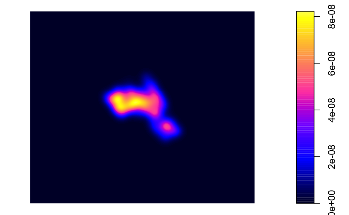
We can also create contour plots in R. Simply enter contour(kde) into R. To map the raster in tmap, we first need to ensure it has been projected correctly.
# converts to raster
kde <- raster(kde.output)
# sets projection to British National Grid
projection(kde) <- CRS("+init=EPSG:27700")

library(tmap)

# maps the raster in tmap, "ud" is the density variable
tm_shape(kde) + tm_raster("ud")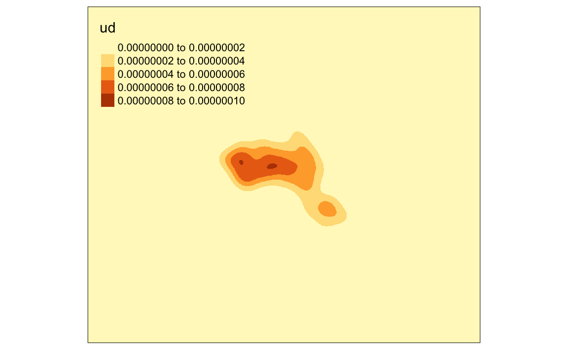
We can just about make out the shape of Camden. However, in this case the raster includes a lot of empty space, we can zoom in on Camden by setting the map to the extents of a bounding box.
# creates a bounding box based on the extents of the OA.Census polygon
bounding_box <- bb(OA.Census)

# maps the raster within the bounding box
tm_shape(kde, bbox = bounding_box) + tm_raster("ud")
#> Legend labels were too wide. The labels have been resized to 0.66, 0.66, 0.66, 0.66, 0.66. Increase legend.width (argument of tm_layout) to make the legend wider and therefore the labels larger.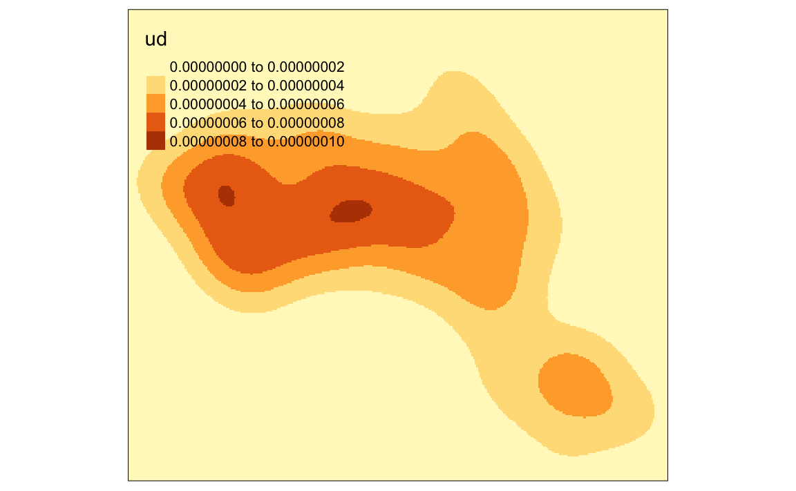
We can also mask (or clip) the raster by the output areas polygon and tidy up the graphic.
# mask the raster by the output area polygon
masked_kde <- raster::mask(kde, OA.Census)

# maps the masked raster, also maps white output area boundaries
tm_shape(masked_kde, bbox = bounding_box) + tm_raster("ud", style = "quantile", n = 100, legend.show = FALSE, palette = "YlGnBu") +
tm_shape(OA.Census) + tm_borders(alpha=.3, col = "white") +
tm_layout(frame = FALSE)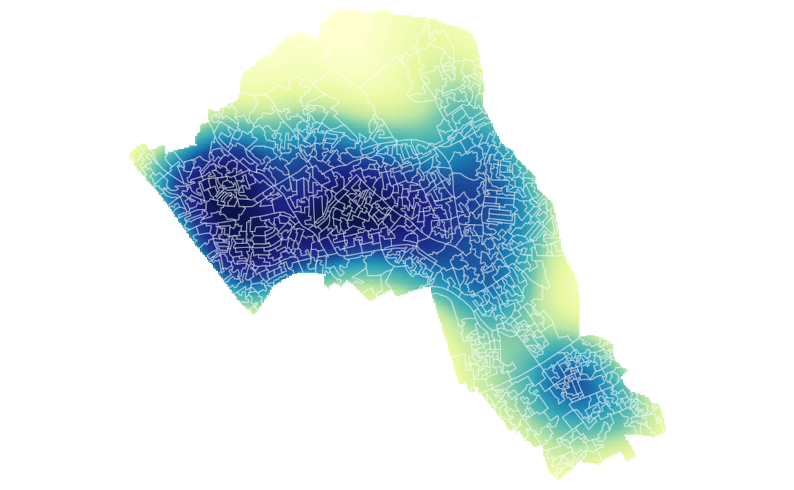
We can also create catchment boundaries from the kernel density estimations.
# compute homerange ranges for 75%, 50%, 25% of points, objects are returned as spatial polygon data frames
range75 <- getverticeshr(kde.output, percent = 75)
range50 <- getverticeshr(kde.output, percent = 50)
range25 <- getverticeshr(kde.output, percent = 25)
With the ranges calculated we can then map them all in tmap. Notice that this tmap combines multiple layers. Remember the layer at the bottom of the list is the last one to be printed, and therefore will appear at the front of the graphic.
Upon first glance the code looks quite complicated as it maps multiple layers. So to summarise each line does the following…
.   Create a grey background using the OA.Census polygon with white borders
.   Plot the locations of houses using House.Points
.   Plot the 75% range, set attributes for border and fill (i.e. colour, transparency, line width)
.   Plot the 50% range, set attributes for border and fill (i.e. colour, transparency, line width)
.   Plot the 25% range, set attributes for border and fill (i.e. colour, transparency, line width)
.   The outside frame is removed
# the code below creates a map of several layers using tmap
tm_shape(OA.Census) + tm_fill(col = "#f0f0f0") + tm_borders(alpha=.8, col = "white") +
tm_shape(House.Points) + tm_dots(col = "blue") +
tm_shape(range75) + tm_borders(alpha=.7, col = "#fb6a4a", lwd = 2) + tm_fill(alpha=.1, col = "#fb6a4a") +
tm_shape(range50) + tm_borders(alpha=.7, col = "#de2d26", lwd = 2) + tm_fill(alpha=.1, col = "#de2d26") +
tm_shape(range25) + tm_borders(alpha=.7, col = "#a50f15", lwd = 2) + tm_fill(alpha=.1, col = "#a50f15") +
tm_layout(frame = FALSE)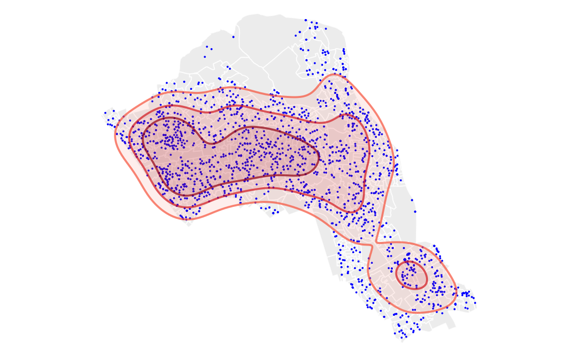
Now try adding on an addition range for the densest 10% of our data.
If you wish to save your raster files to your computer, you can use the WriteRaster() function.
writeRaster(masked_kde, filename = "kernel_density.grd")Okay, perhaps mapping the densities of house prices isn’t that interesting, but this technique can be applied to all sorts of point datasets.
12.2 Task:
Create a crime hotspot map (using KDE) of anti-social behaviour for the London Borough of Kensington and Chelsea in December 2018.