4 Describing Data - Plots
This week we are picking up where we left off in the previous section. Repeat the opening steps in last weeks practical to reload the input object. Through plotting we can provide graphical representations of the data to support the statistics above. To simply have the Ward codes on the x-axis and their assault values on the y-axis we need to plot the relevant columns of the input object.
#Here we reload the object - note that the file path will be different for your own system so should be adjusted accordingly.

input <- read.csv("worksheet_data/camden/ambulance_assault.csv")
plot(input$WardCode, input$assault_09_11)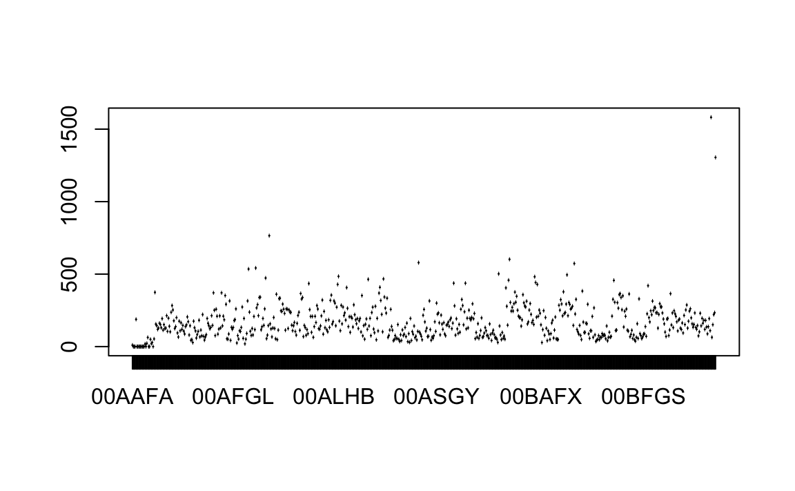
4.1 Histograms
The basic plot created in the previous step doesn’t look great and it is hard to interpret the raw assault count values. A frequency distribution plot in the form of a histogram will be better. You will learn more about frequency distributions next week so just for now we will focus on generating the plots. There are many ways to do this in R but we will use the functions contained within the ggplot2 library.
library(ggplot2)

p_ass <- ggplot(input, aes(x=assault_09_11))
The ggplot(input, aes(x=assault_09_11)) section means create a generic plot object (called p.ass) from the input object using the assault_09_11 column as the data for the x axis. Remember the data variables are required as aesthetics parameters so the assault_09_11 appears in the aes() brackets. Histograms provide a nice way of graphically summarising a dataset. To create the histogram you need to add the relevant ggplot2 command (geom).
p_ass +
  geom_histogram()
#> `stat_bin()` using `bins = 30`. Pick better value with `binwidth`.
## stat_bin: binwidth defaulted to range/30. Use 'binwidth = x' to adjust this.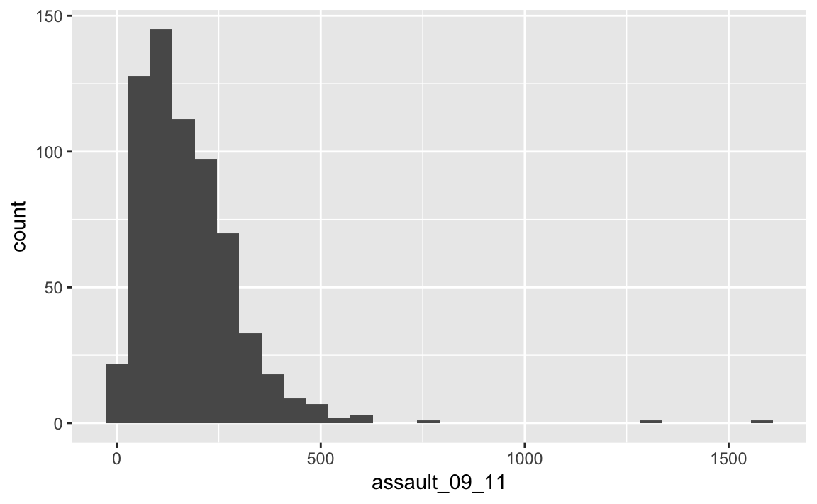
The height of each bar (the x-axis) shows the count of the datapoints and the width of each bar is the value range of datapoints included. If you want the bars to be thinner (to represent a narrower range of values and capture some more of the variation in the distribution) you can adjust the binwidth. Binwidth controls the size of ‘bins’ that the data are split up into. We will discuss this in more detail later in the course, but put simply, the bigger the bin (larger binwidth) the more data it can hold. Try:
p_ass +
  geom_histogram(binwidth=10) +
geom_density(fill=NA, colour="black") 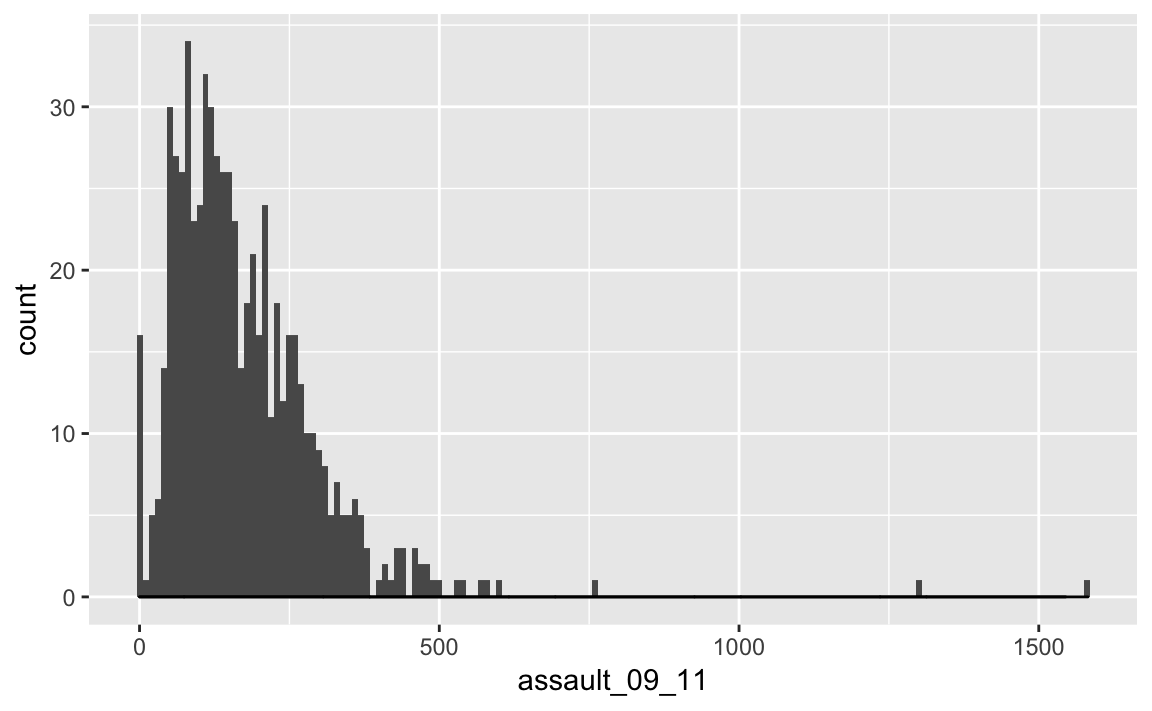
You can also overlay a density distribution over the top of the histogram. Again, this will be discussed in more detail next week, but think of the plotted line as a summary of the underlying histogram. For this we need to produce a second plot object that says we wish to use the density distribution as the y variable.
p2_ass <- ggplot(input, aes(x=assault_09_11, y=..density..))

p2_ass +
  geom_histogram() +
  geom_density(fill=NA, colour="red")
#> `stat_bin()` using `bins = 30`. Pick better value with `binwidth`.
## stat_bin: binwidth defaulted to range/30. Use 'binwidth = x' to adjust this.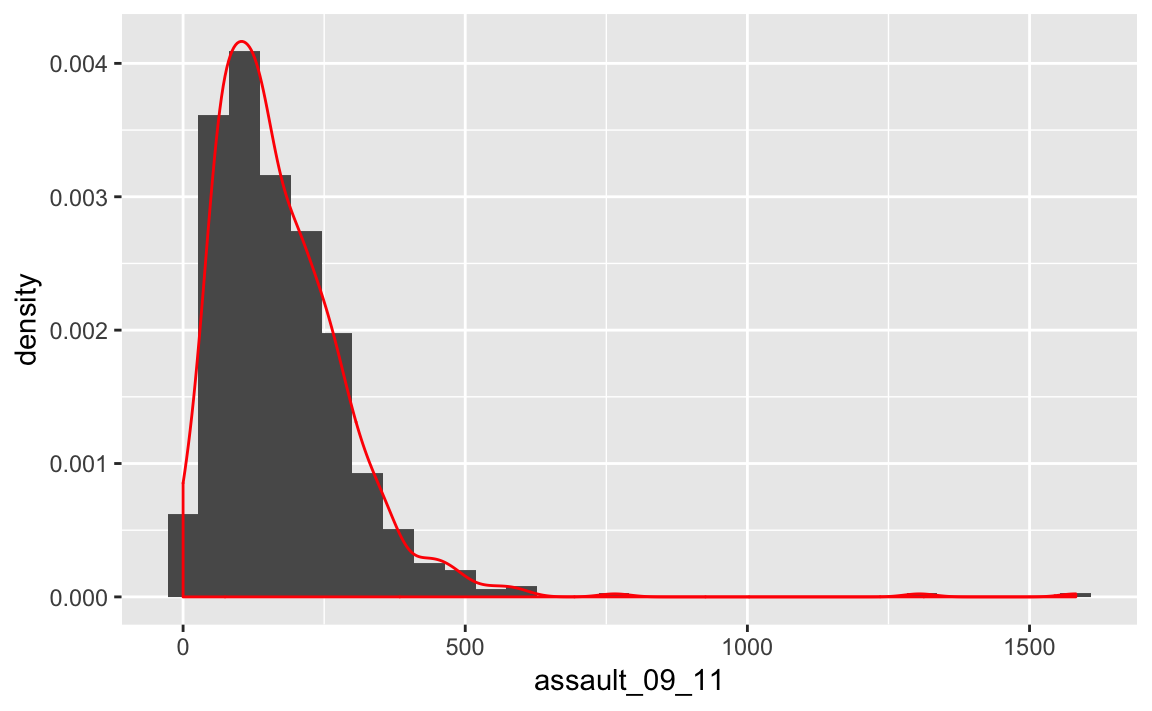
This plot has provided a good impression of the overall distribution, but it would be interesting to see characteristics of the data within each of the Boroughs. We can do this since each Borough in the input object is made up of multiple wards. To see what I mean, we can select all the wards that fall within the Borough of Camden, which has the code 00AG (if you want to see what each Borough the code corresponds to, and learn a little more about the statistical geography of England and Wales, then see here: http://en.wikipedia.org/wiki/ONS_coding_system).
camden <- input[input$Bor_Code=="00AG",]The crucial part of the code snippet above is what’s included in the square brackets [ ]. We are subsetting the input object, but instead of telling R what column names or numbers we require, we are requesting all rows in the Bor_Code column that contain00AG. 00AG is a text string so it needs to go in speech marks “” and we need to use two equals signs == in R to mean “equals to”. A single equals sign = is another way of assigning objects (it works the same way as <- but is much less widley used for this purpose because it is used when paramaterising functions). So to produce Camden’s frequency distribution the code above needs to be replicated using the camden object in the place of input
p_ass_camden <- ggplot(camden, aes(x=assault_09_11))

p_ass_camden +
  geom_histogram()
#> `stat_bin()` using `bins = 30`. Pick better value with `binwidth`.
## stat_bin: binwidth defaulted to range/30. Use 'binwidth = x' to adjust this.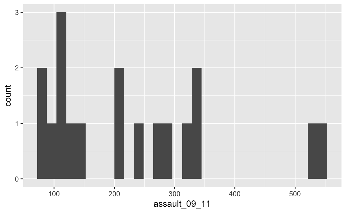
#We can also add a title using the ggtitle() option

p_ass_camden +
  geom_histogram() +
  ggtitle("Camden Assault")
#> `stat_bin()` using `bins = 30`. Pick better value with `binwidth`.

## stat_bin: binwidth defaulted to range/30. Use 'binwidth = x' to adjust this.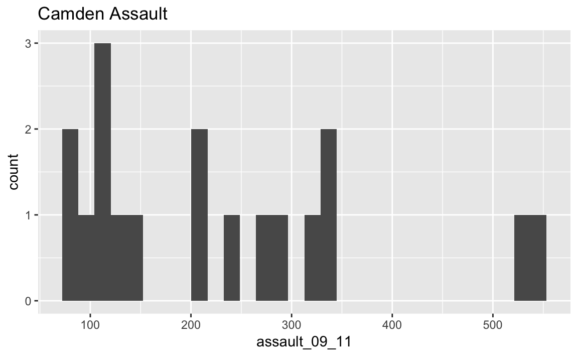
As you can see this looks a little different from the density of the entire dataset. This is largely becasue we have relatively few rows of data in the camden object (use nrow(camden) to find out just how many). Nevertheless it would be interesting to see the data distributions for each of the London Boroughs. It is a chance to use the facet_wrap() function in R. This brilliant function lets you create a whole load of graphs at once.
#note that we are back to using the p.ass ggplot object since we need all our data for this. This code may generate a large number of warning messages relating to the plot binwidth, don't worry about them.
p_ass +
geom_histogram() +
facet_wrap(~Bor_Code)
#> `stat_bin()` using `bins = 30`. Pick better value with `binwidth`.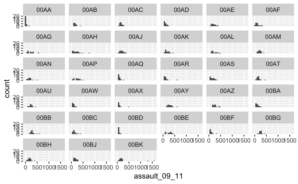 …or you could use
 facet_wrap() to plot according to WardType. What are the key differences in the distributions between the different types?
p_ass +
  geom_histogram() +
  facet_wrap(~WardType)
#> `stat_bin()` using `bins = 30`. Pick better value with `binwidth`.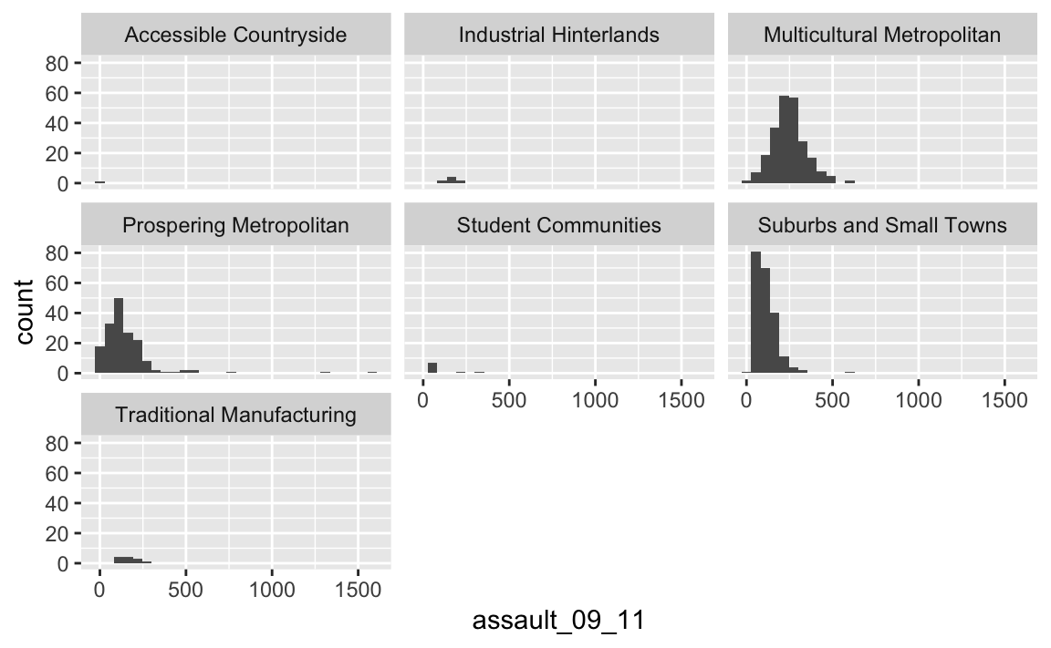
The facet_wrap() part of the code simply needs the name of the column you would like to use to subset the data into individual plots. Before the column name a tilde ~ is used as shorthand for “by” - so using the function we are asking R to facet the input object into lots of smaller plots based on the Bor_Code column in the first example and WardType in the second. Use the facet_wrap() help file to learn how to create the same plot but with the graphs arranged into 4 columns.
4.2 Box and Whisker Plots
In addition to histograms, a type of plot that shows the core characteristics of the distribution of values within a dataset, and includes some of the summary() information we generated earlier, is a box and whisker plot (boxplot for short). These too can be easily produced in R. The diagram below illustrates the components of a box and whisker plot. How these relate to the frequency distribution plots we created above will be explored next week. 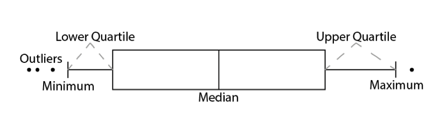
We can create a third plot object for this from the input object:
#note that the `assault_09_11` column is now y and not x and that we have specified x=1. This aligns the plot to the x-axis (any single number would work)

p3_ass <- ggplot(input, aes(x=1, y=assault_09_11))
And then convert it to a boxplot using the geom_boxplot() command.
p3_ass +
  geom_boxplot()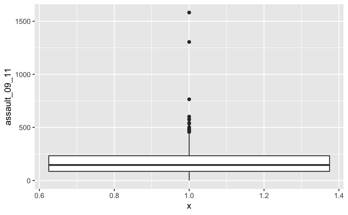
If we are just interested in Camden then we can use the camden object created above in the code.
p3_ass_camden <- ggplot(camden, aes(x=1, y=assault_09_11))

p3_ass_camden +
  geom_boxplot()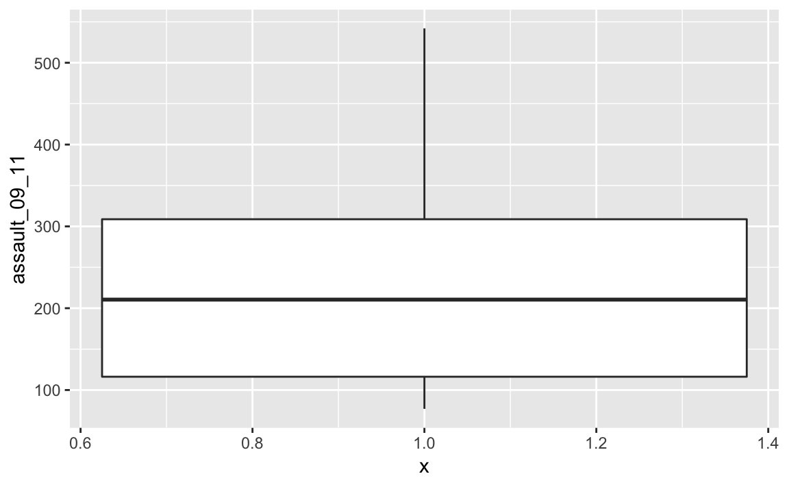
#If you prefer you can flip the plot 90 degrees so that it reads from left to right.

p3_ass_camden +
  geom_boxplot()+
  coord_flip()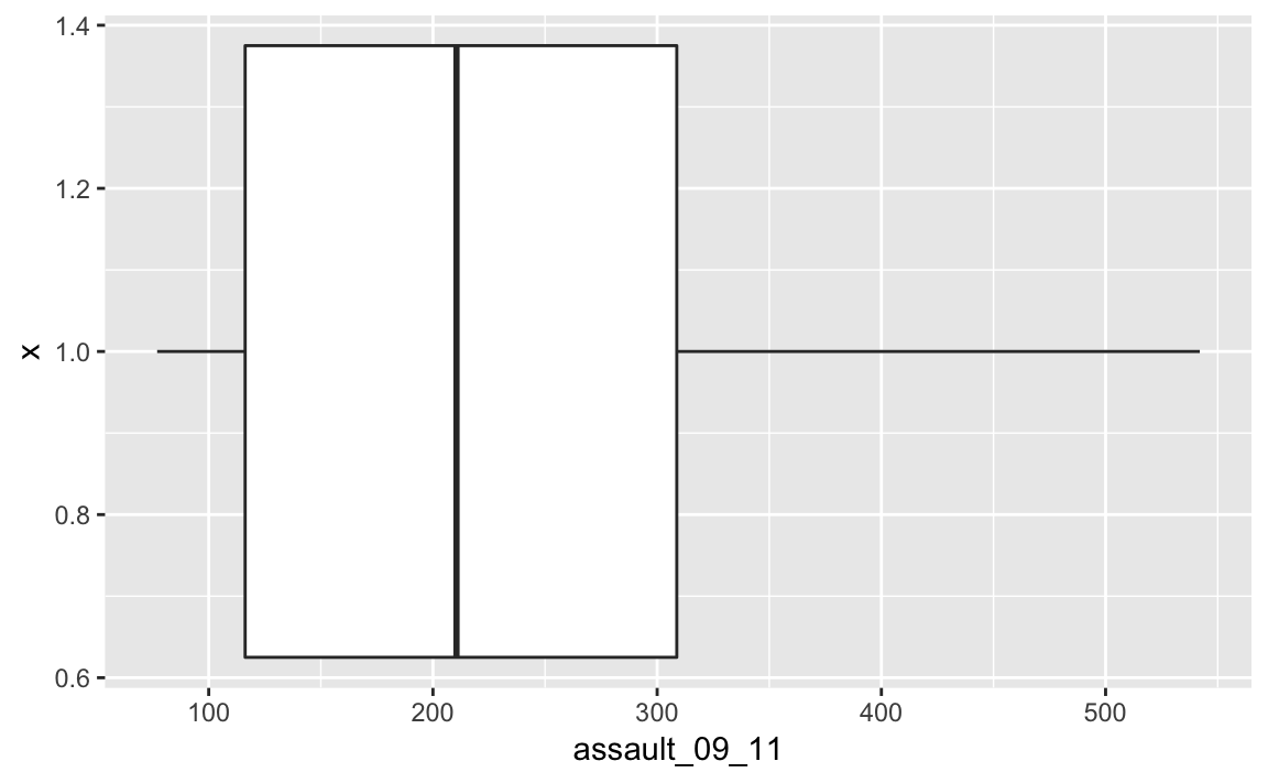
You can see that Camden looks a little different to the boxplot of the entire dataset. It would therefore be useful to compare the distributions of data within each of the Boroughs in a single plot as we did with the frequency distributions above. ggplot makes this very easy, we just need to change the x= parameter to the Borough code column (Bor_Code).
p4_ass <- ggplot(input, aes(x=Bor_Code, y=assault_09_11))

p4_ass +
  geom_boxplot()+
  coord_flip()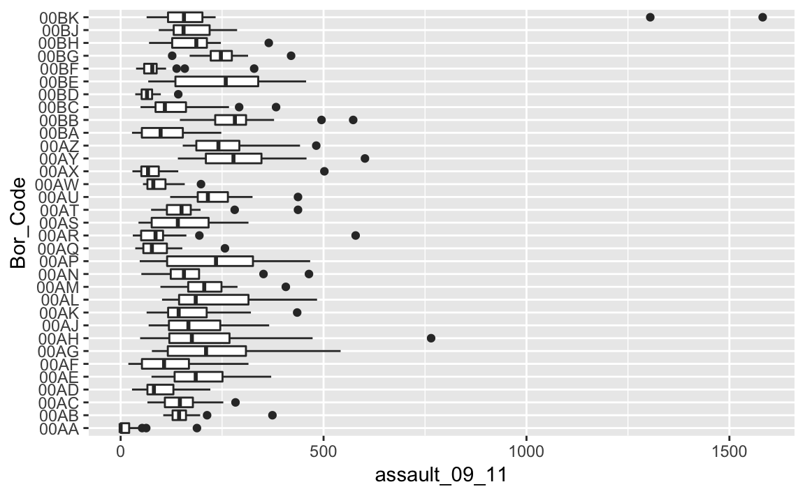
4.3 Recap
In this final section you: 1. Utilised some of the advanced functionality as part of the ggplot2 package, not least through the creation of facetted histogram plots using geom_histogram() and facet_wrap() and also box and whisker plots with boxplot(). 2. Subset data based on a specific criteria (in this case selection the data corresponding to Camden). 3. Explored the distribution of dataset through histograms, density and boxplots.
4.4 Task
Take census-historic-population-borough.csv file we used to produce the scatter plots of London’s population and create 3 different types of plot from one or more of the variables.