8 Measuring Spatial Autocorrelation
In this practical we will: * Run a global spatial autocorrelation for the borough of Camden * Identify local indicators of spatial autocorrelation * Run a Getis-Ord
First we must set the working directory and load the practical data.
# Remember to set the working directory as usual

# Load the data. You may need to alter the file directory
Census.Data <-read.csv("worksheet_data/camden/practical_data.csv")
We will also need the load the spatial data files from the previous practicals.
# load the spatial libraries
library("sp")
library("rgdal")
library("rgeos")

# Load the output area shapefiles
Output.Areas <- readOGR("worksheet_data/camden", "Camden_oa11")
#> OGR data source with driver: ESRI Shapefile
#> Source: "/Users/jamestodd/Desktop/GitHub/learningR/worksheet_data/camden", layer: "Camden_oa11"
#> with 749 features
#> It has 1 fields
# join our census data to the shapefile
OA.Census <- merge(Output.Areas, Census.Data, by.x="OA11CD", by.y="OA")
Remember the distribution of our qualification variable? We will be working on that today. We should first map it to remind us of its spatial pattern.
library("tmap")

tm_shape(OA.Census) + tm_fill("Qualification", palette = "Reds", style = "quantile", title = "% with a Qualification") + tm_borders(alpha=.4) 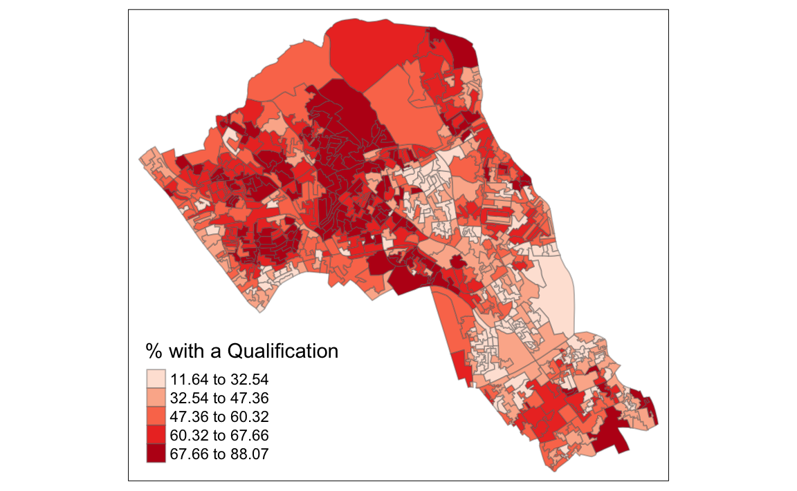
8.1 Running a spatial autocorrelation
A spatial autocorrelation measures how distance influences a particular variable across a dataset. In other words, it quantifies the degree of which objects are similar to nearby objects. Variables are said to have a positive spaital autocorrelation when similar values tend to be nearer together than dissimilar values.
Waldo Tober’s first law of geography is that “Everything is related to everything else, but near things are more related than distant things.” so we would expect most geographic phenomena to exert a spatial autocorrelation of some kind. In population data this is often the case as persons of similar characteristics tend to reside in similar neighbourhoods due to a range of reasons including house prices, proximity to work places and cultural factors.
We will be using the spatial autocorrelation functions available from the spdep package.
library(spdep)8.1.1 Finding neighbours
In order for the subsequent model to work, we need to work out what polygons neighbour each other. The following code will calculate neighbours for our OA.Census polygon and print out the results below.
# Calculate neighbours
neighbours <- poly2nb(OA.Census)
neighbours
#> Neighbour list object:
#> Number of regions: 749
#> Number of nonzero links: 4342
#> Percentage nonzero weights: 0.774
#> Average number of links: 5.8
We can plot the links between neighbours to visualise their distribution across space.
plot(OA.Census, border = 'lightgrey')
plot(neighbours, coordinates(OA.Census), add=TRUE, col='red')
# Calculate the Rook's case neighbours
neighbours2 <- poly2nb(OA.Census, queen = FALSE)
neighbours2
#> Neighbour list object:
#> Number of regions: 749
#> Number of nonzero links: 4176
#> Percentage nonzero weights: 0.744
#> Average number of links: 5.58We can already see that this approach has identified fewer links between neighbours. By plotting both neighbour outputs we can interpret their differences.
# compares different types of neighbours
plot(OA.Census, border = 'lightgrey')
plot(neighbours, coordinates(OA.Census), add=TRUE, col='blue')
plot(neighbours2, coordinates(OA.Census), add=TRUE, col='red')
We can represent spatial autocorrelation in two ways; globally or locally. Global models will create a single measure which represent the entire data whilst local models let us explore spatial clustering across space.
8.1.2 Running a global spatial autocorrelation
With the neighbours defined. We can now run a model. First we need to convert the data types of the neighbours object. This file will be used to determine how the neighbours are weighted
# Convert the neighbour data to a listw object
listw <- nb2listw(neighbours2, style="W")
listw
#> Characteristics of weights list object:
#> Neighbour list object:
#> Number of regions: 749
#> Number of nonzero links: 4176
#> Percentage nonzero weights: 0.744
#> Average number of links: 5.58
#>
#> Weights style: W
#> Weights constants summary:
#>     n     nn  S0  S1   S2
#> W 749 561001 749 285 3114
8.2 Moran’s I Background
(this information has been adapted from the following link: https://geodacenter.github.io/workbook/5a_global_auto/lab5a.html)
Moran’s I statistic is arguably the most commonly used indicator of global spatial autocorrelation. It was initially suggested by Moran (1948), and popularized through the classic work on spatial autocorrelation by Cliff and Ord (1973). In essence, it is a cross-product statistic between a variable and its spatial lag, with the variable expressed in deviations from its mean.
Inference for Moran’s I is based on a null hypothesis of spatial randomness. The distribution of the statistic under the null can be derived using either an assumption of normality (independent normal random variates), or so-called randomization (i.e., each value is equally likely to occur at any location).
An alternative to an analytical derivation is a computational approach based on permutation. This calculates a reference distribution for the statistic under the null hypothesis of spatial randomness by randomly permuting the observed values over the locations. The statistic is computed for each of these randomly reshuffled data sets, which yields a reference distribution.
This distribution is then used to calculate a so-called pseudo p-value. The pseudo p-value is only a summary of the results from the reference distribution and should not be interpreted as an analytical p-value. Most importantly, it should be kept in mind that the extent of significance is determined in part by the number of random pemutations. More precisely, a result that has a p-value of 0.01 with 99 permutations is not necessarily more significant than a result with a p-value of 0.001 with 999 permutations.
8.2.1 Moran scatter plot
The Moran scatter plot, first outlined in Anselin (1996), consists of a plot with the spatially lagged variable on the y-axis and the original variable on the x-axis. The slope of the linear fit to the scatter plot equals Moran’s I.
An important aspect of the visualization in the Moran scatter plot is the classification of the nature of spatial autocorrelation into four categories. Since the plot is centered on the mean (of zero), all points to the right of the mean have zi>0 and all points to the left have zi<0. We refer to these values respectively as high and low, in the limited sense of higher or lower than average. Similarly, we can classify the values for the spatial lag above and below the mean as high and low.
The scatter plot is then easily decomposed into four quadrants. The upper-right quadrant and the lower-left quadrant correspond with positive spatial autocorrelation (similar values at neighboring locations). We refer to them as respectively high-high and low-low spatial autocorrelation. In contrast, the lower-right and upper-left quadrant correspond to negative spatial autocorrelation (dissimilar values at neighboring locations). We refer to them as respectively high-low and low-high spatial autocorrelation.
The classification of the spatial autocorrelation into four types begins to make the connection between global and local spatial autocorrelation. However, it is important to keep in mind that the classification as such does not imply significance. This is further explored in our discussion of local indicators of spatial association (LISA).
We can now run the model. This type of model is known as a moran’s test. This will create a correlation score between -1 and 1. Much like a correlation coefficient, 1 determines perfect postive spatial autocorrelation (so our data is clustered), 0 identifies the data is randomly distributed and -1 represents negative spatial autocorrelation (so dissimilar values are next to each other).
# global spatial autocorrelation
moran.test(OA.Census$Qualification, listw)
#>
#>  Moran I test under randomisation
#>
#> data:  OA.Census$Qualification
#> weights: listw
#>
#> Moran I statistic standard deviate = 20, p-value <2e-16
#> alternative hypothesis: greater
#> sample estimates:
#> Moran I statistic       Expectation          Variance
#>          0.544870         -0.001337          0.000506
The moran I statistic is 0.54, we can therefore determine that there our qualification variable is positively autocorrelated in Camden. In other words, the data does spatially cluster. We can also consider the p-value to consider the statistical significance of the mode.
8.2.2 Running a local spatial autocorrelation
We will first create a moran plot which looks at each of the values plotted against their spatially lagged values. It basically explores the relationship between the data and their neighbours as a scatter plot.
# creates a moran plot
moran <- moran.plot(OA.Census$Qualification, listw = nb2listw(neighbours2, style = "C"),asp=T)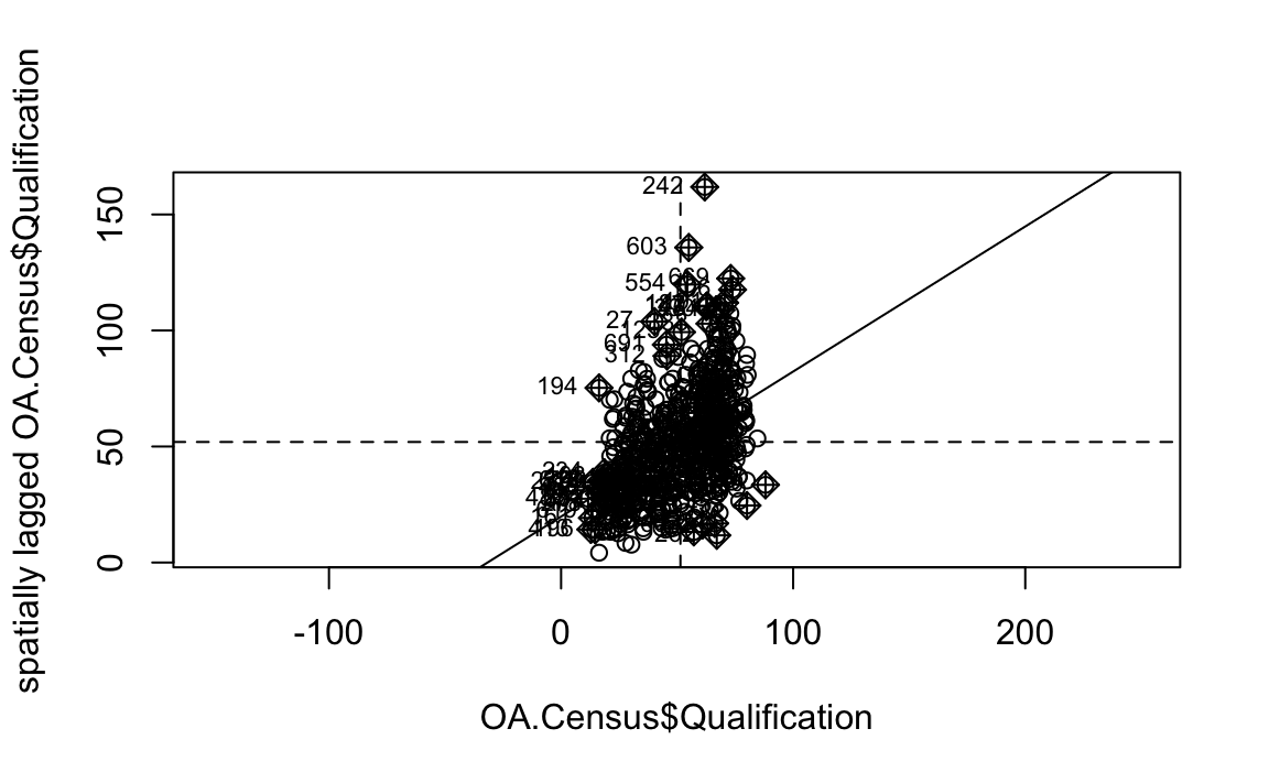
Is it possible to determine a positive relationship from observing the scatter plot?
# creates a local moran output
local <- localmoran(x = OA.Census$Qualification, listw = nb2listw(neighbours2, style = "W"))
By considering the help page for the localmoran function (run ?localmoran in R) we can observe the arguments and outputs. We get a number of useful statistics from the mode which are as defined:
| Name | Description |
|---|---|
| Ii | local moran statistic |
| E.Ii | expectation of local moran statistic |
| Var.Ii | variance of local moran statistic |
| Z.Ii | standard deviation of local moran statistic |
| Pr() | p-value of local moran statistic |
First we will map the local moran statistic (Ii). A positive value for Ii indicates that the unit is surrounded by units with similar values.
# binds results to our polygon shapefile
moran.map <- OA.Census
moran.map@data<- cbind(OA.Census@data, local)
# maps the results
tm_shape(moran.map) + tm_fill(col = "Ii", style = "quantile", title = "local moran statistic")
#> Variable "Ii" contains positive and negative values, so midpoint is set to 0. Set midpoint = NA to show the full spectrum of the color palette.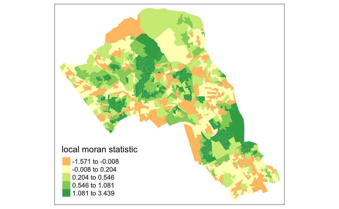 From the map it is possible to exist the variations in autocorrelation across space. We can interpret that there seems to be a geographic pattern to the autocorrelation. Why not try to make a map of the P-value to observe variances in significance across Camden? Use
 names(moran.map@data) to find the column headers.
It is not possible to understand if these are clusters of high or low values. One thing we could try to do is to create a map which labels the features based on the types of relationships they share with their neighbours (i.e. high and high, low and low, insigificant, etc…). For this we refer back to the Moran’s I plot created a few moments ago.
moran <- moran.plot(OA.Census$Qualification, listw = nb2listw(neighbours2, style = "W"),asp=T)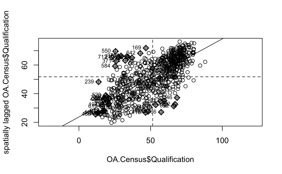
You’ll notice that the plots features a vertical and horizontal line that break it into the quandrants referred to in the text above. Top right in the plot are areas with a high value surrounded by areas with a high value, bottom left are low value areas surrounded by low values. Top left is “Low-High” bottom right is “High-Low”.
The code below first extracts the data that fall in each quadrant and assigns them either 1,2,3,4 depending on which they fall into, and those values deemed insignificant get assigned zero.
### to create LISA cluster map ###
quadrant <- vector(mode="numeric",length=nrow(local))

# centers the variable of interest around its mean
m.qualification <- OA.Census$Qualification - mean(OA.Census$Qualification)

# centers the local Moran's around the mean
m.local <- local[,1] - mean(local[,1])

# significance threshold
signif <- 0.1

# builds a data quadrant
quadrant[m.qualification <0 & m.local<0] <- 1
quadrant[m.qualification <0 & m.local>0] <- 2
quadrant[m.qualification >0 & m.local<0] <- 3
quadrant[m.qualification >0 & m.local>0] <- 4
quadrant[local[,5]>signif] <- 0
We can now build the plot based on these values - assigning each a colour and also a label.
# plot in r
brks <- c(0,1,2,3,4)
colors <- c("white","blue",rgb(0,0,1,alpha=0.4),rgb(1,0,0,alpha=0.4),"red")
plot(OA.Census,border="lightgray",col=colors[findInterval(quadrant,brks,all.inside=FALSE)])
box()legend("bottomleft",legend=c("insignificant","low-low","low-high","high-low","high-high"),
fill=colors,bty="n")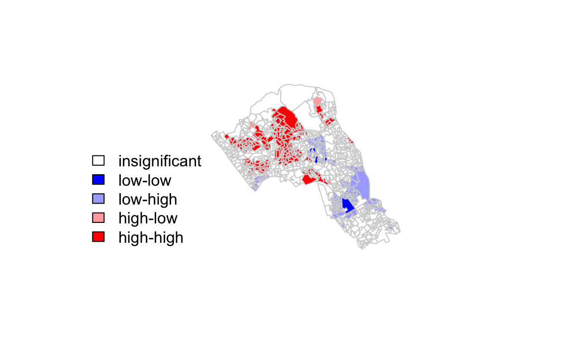
The resulting map reveals that it is apparent that there is a statistically significant geographic pattern to the clustering of our qualification variable in Camden.
8.2.3 A note on the range of values
We should expect the Local Moran’s I values to fall between -1 and + 1, in our case from the map we created it is clear that they fall slightly above and slightly below. This is not a disaster, but it does indicate that something may not be quite right in the way that we have defined our neighbour relationships.
The most common problem is that the weights have not been row-standardised. Row standardisation is used to create proportional weights in cases where features have an unequal number of neighbours. It involves dividing each neighbour weight for a feature by the sum of all neighbour weights for that feature, and is recommended whenever the distribution of features is potentially biased due to sampling design or an imposed aggregation scheme. This is commonly the case in social datasets of the kind we are looking at here. In our code:
local <- localmoran(x = OA.Census$Qualification, listw = nb2listw(neighbours2, style = "W"))You will see the style="W" parameter. This instructs the nb2listw function to row standardise the weights, so that can’t be the cause of the larger range of values we see here. The nb2listw help file gives alternative standarisation approaches to the weighting, give them a try to see the impacts on the resulting Moran’s I output.
So if we have taken the correct approach with the row standardisation, what else could it be? Most likely is either that our input variable is strongly skewed (you can perhaps create a histogram of the data values to see this), and/or some features have very few neighbors. Ideally you will want each feature to have at least eight neighbors, which is unlikely to be the case for Camden given the parameters we have used, and the fact that so many spatial units occur along the edge of the boundary.
Given that the adjacency (as in the Rook or Queen’s case) hasn’t been sufficient to reach the threhold of 8 we can look to a distance based approach. In the code below we say that any areas that are within 2.5km (2500m) of one another are considered neighbours.
#Create new neighbours, within 2000m
nb <- dnearneigh(coordinates(OA.Census),0,2500)

#Perform Moran's I
local <- localmoran(x = OA.Census$Qualification, listw = nb2listw(nb, style = "W"))

#Join to spatial data
moran.map <- OA.Census
moran.map@data<- cbind(OA.Census@data, local)

#Create map
tm_shape(moran.map) + tm_fill(col = "Ii", style = "quantile", title = "local moran statistic")
#> Variable "Ii" contains positive and negative values, so midpoint is set to 0. Set midpoint = NA to show the full spectrum of the color palette.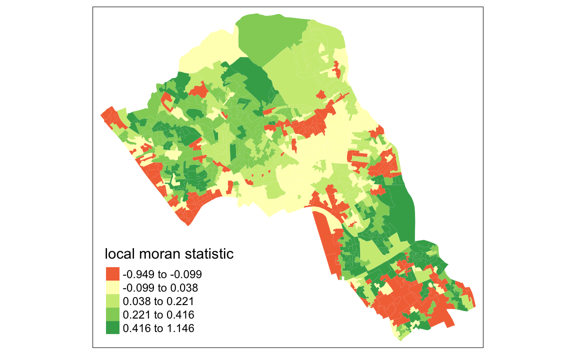
Now you can see the values are bounded between -1 and +1 (okay, it’s slightly above with a value of 1.146).
Try now with a 1km neighbour threshold and a 4km threshold. What impact does this have on the Moran’s I values? How might you judge what is the best approach?
These links provide some useful additonal information:
An intro to Moran’s I for non-spatial statisticians: http://www.isca.in/MATH_SCI/Archive/v3/i6/2.ISCA-RJMSS-2015-019.pdf
This paper is a little technical: https://onlinelibrary.wiley.com/doi/pdf/10.1111/j.1538-4632.1984.tb00797.x
Some slides from Roger Bivand, who created the R package that we use for this. http://www.bias-project.org.uk/ASDARcourse/unit6_slides.pdf
8.3 Getis-Ord
Another approach we can take is hot-spot analysis. The Getis-Ord Gi Statistic looks at neighbours within a defined proximity to identify where either high or low values cluster spatially.Here statistically significant hot spots are recognised as areas of high values where other areas within a neighbourhood range also share high values too.
First we can tweak our new set of neighbours, based on proximity.
# creates centroid and joins neighbours within 0 and x units
nb <- dnearneigh(coordinates(OA.Census),0,800)
# creates listw
nb_lw <- nb2listw(nb, style = 'B')
# plot the data and neighbours
plot(OA.Census, border = 'lightgrey')
plot(nb, coordinates(OA.Census), add=TRUE, col = 'red')Note in this example map below we only had a search radius of 250 metres to demonstrate the function. However, it means that some areas do not have any defined nearest neighbours so we will need to search 800 meters or more for our model in Camden. 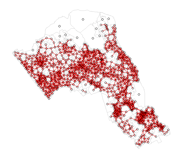
With a set of neighbourhoods estabilished we can now run the test.
# compute Getis-Ord Gi statistic
local_g <- localG(OA.Census$Qualification, nb_lw)

local_g_sp<- OA.Census

local_g_sp@data <- cbind(OA.Census@data, as.matrix(local_g))
names(local_g_sp)[6] <- "gstat"

# map the results
tm_shape(local_g_sp) + tm_fill("gstat", palette = "RdBu", style = "pretty") + tm_borders(alpha=.4)
#> Variable "gstat" contains positive and negative values, so midpoint is set to 0. Set midpoint = NA to show the full spectrum of the color palette.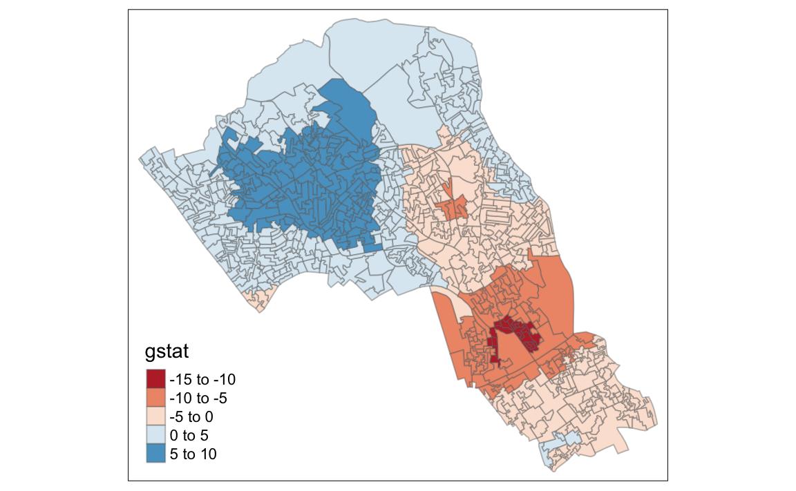
The Gi Statistic is represented as a Z-score. Greater values represent a greater intensity of clustering and the direction (positive or negative) indicates high or low clusters.
8.4 Additional Task
Repeat the analysis you have undertaken in this worksheet for the London Borough of Southwark. The data can be found on the data.cdrc.ac.uk website in the same way you found the data for Camden.